
August is a good time to slow down, recharge, and enjoy the final weeks of summer - but it is also the moment to start preparing your Etsy shop for the Holiday Season. This year, that preparation comes with an important change. Etsy has introduced new listing appearance in browsers, making Etsy listing pages cleaner, more visual, and easier to scan. As you review and update your listings and storefront for Q4, here is a quick guide to the key areas to focus on - from images and descriptions to product details and overall shop appearance - so you are ready for the busiest months ahead.
Etsy Listing Page Update - Summer 2026
Etsy’s listing pages are getting a fresh new look, designed to help shoppers find the most important details faster. Not every buyer or seller will see the same version yet, as Etsy appears to be running split tests across different browsers, accounts,and devices. Still, the update gives us a useful preview of where Etsy is heading.
Let’s look at the main changes and where to focus on the new desktop listing layout and how to optimize it for better Etsy customer experience and smooth buyer journey.
And with your Etsy Q4 preparation around the corner, the timing is perfect. We usually recommend using August and September for a quick seasonal refresh, so this is a great opportunity to review your listings, adapt them to the new layout where needed, and make sure your shop is ready to shine during the busiest shopping season of the year.
1. Understanding Etsy's new listing layout
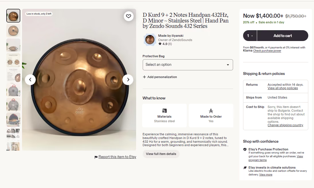
The new Etsy listing layout is organized into three clear sections that update how buyers discover information and make purchasing decisions. We will take a look at how to optimize your Etsy buyer journey through making best use of it.
Images appear on the left. The middle section includes the main listing details - shop information, variations, personalization options, key product details, and a short description preview. The right column is focused on the final purchase decision - price, Add to Cart, shipping information, return policies, and buyer-protection messages.
This creates a much clearer buying journey - Visual appeal -> Practical details and reasons to buy -> Reassurance and final decision
We will see how the new listing layout affects performance over the coming season, but Etsy’s goal is clear - to make the buying process easier and faster and, ultimately, improve conversion rates.
2. The new aspect ratio for your first Etsy listing image - 4:5
One of the important changes to consider when doing your visual refresh for the season is how Etsy now displays the first image in your listing.
To fit the new column layout, Etsy crops the main image into a portrait format with a 4:5 aspect ratio.
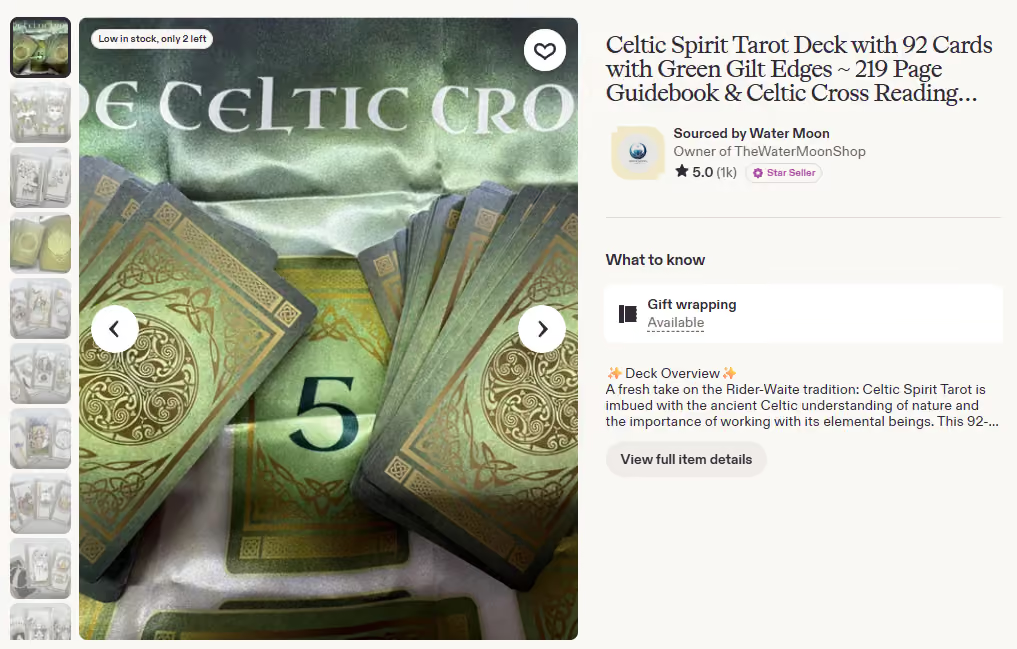
This is similar to how Etsy already crops listing thumbnails in search, but this is the first time the main image is being cropped inside the listing itself.
Why does this matter? Just like your search thumbnail, the first listing image is your opportunity to make a strong visual impression. A poor automatic crop can remove important product details, weaken the presentation, and make it harder to hold a shopper’s attention. Over time, that may reduce the engagement and quality scores of the listing and not only affect purchase decisions but also visibility in the algorithm.
What should you do? If you currently use landscape or square images, review your listings and check how the automatic crop appears. In the example here, the original landscape image is well composed, but the 4:5 crop cuts out the name of the tarot deck - an important part of the product’s visual presentation.
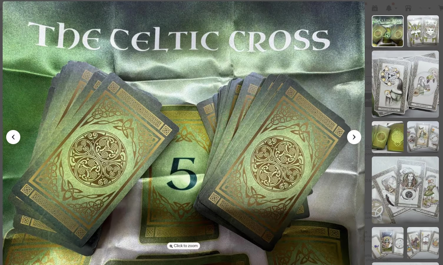
If Etsy crops out something you intended buyers to see, you lose part of the instinctive visual appeal that encourages them to continue towards the next step in the purchase journey.
Start with a general review of your shop. If you see listings that don't crop well, consider changing the first picture or redesigning it to fit the 4:5 ration better.
3. Make better use of Etsy personalization options - the big focus for Etsy's Q4 Holiday Season
Moving to the middle section of the new layout, Etsy is giving much more visibility to personalization and product options. We covered the updated personalization features a couple of months ago, and you can revisit that guide on the Artery Team blog.
One of the main reasons Etsy is moving to the new column-based layout is to create more space for these extended options. As they now sit at the center of the listing page, using them well will play an increasingly important role in conversions.
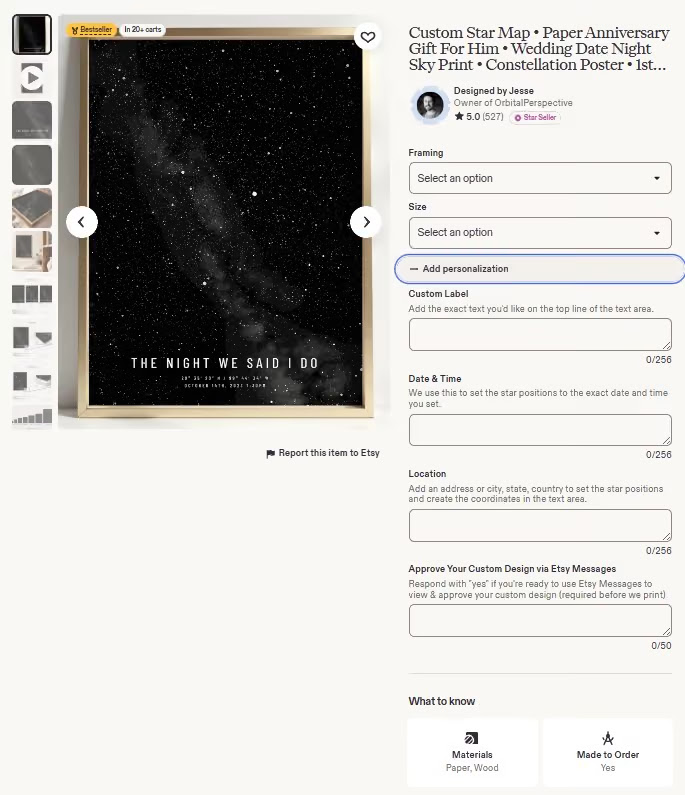
This is not only relevant for personalized products. The expanded section allows you to go beyond Etsy’s original two variations and include up to seven options for colors, sizes, designs, product types, wrapping, sets, and other choices.
Used strategically, this can help shorten the buyer journey and concentrate more sales into fewer, stronger listings. Instead of spreading orders across several similar products, you can bring your top designs and options together in one listing, making it easier for buyers to choose and purchase on the same screen.
That can support stronger conversion, more reviews, and faster growth in listing quality scores. In turn, these listings have a better chance of becoming best-sellers and competing more effectively for important keywords.
This new feature fits perfectly into our long-standing snowball strategy for Etsy and marketplace growth - the stronger a listing performs, the more momentum it can build over time. Deliberately optimizing the buyer journey inside your top Etsy listings can give you a meaningful edge over Etsy competitors in your niche in both conversions and traffic this Holiday Season.
In case you find that updating your listing images will take more time than expected, our Creative Team can help. Just don't wait too long - they have limited Visual Marketing openings for the new season.
4. Etsy listings materials and attributes need to stay readable
The updated page displays up to 3 details inside visual cards under a section such as “What to know.” These may include materials, dimensions, gift wrapping, made to order. This information is easier to scan, but long materials lists can make the column look crowded or uneven. When too many tags wrap across several lines, the clean layout can quickly become messy.
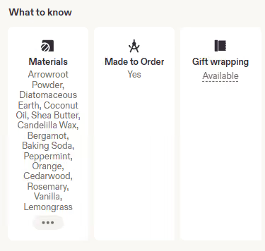
Focus on the core materials that help buyers understand the product, evaluate its quality or signature ingredients.
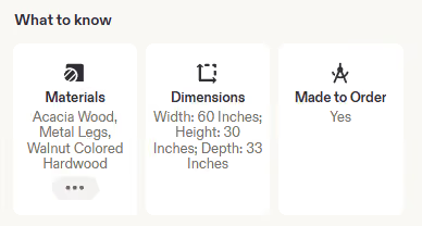
This is usually more useful than a long list of minor production supplies or packaging materials. Accuracy still comes first, especially when a material affects allergies, safety, care, or customer expectations. Where possible, keep the visible list focused and readable. Also check that dimensions match the information shown in the images and description. In a structured layout, inconsistencies are easier to notice.
5. Reviews and seller trust continues expanding to receive more attention
The review area becomes even more prominent in the new design, spanning the full width of the page beneath the three-column layout. Buyers can now see review cards alongside aggregated scores for several key customer satisfaction themes - Item Quality, Shipping, Customer Service, and Overall Recommendation.
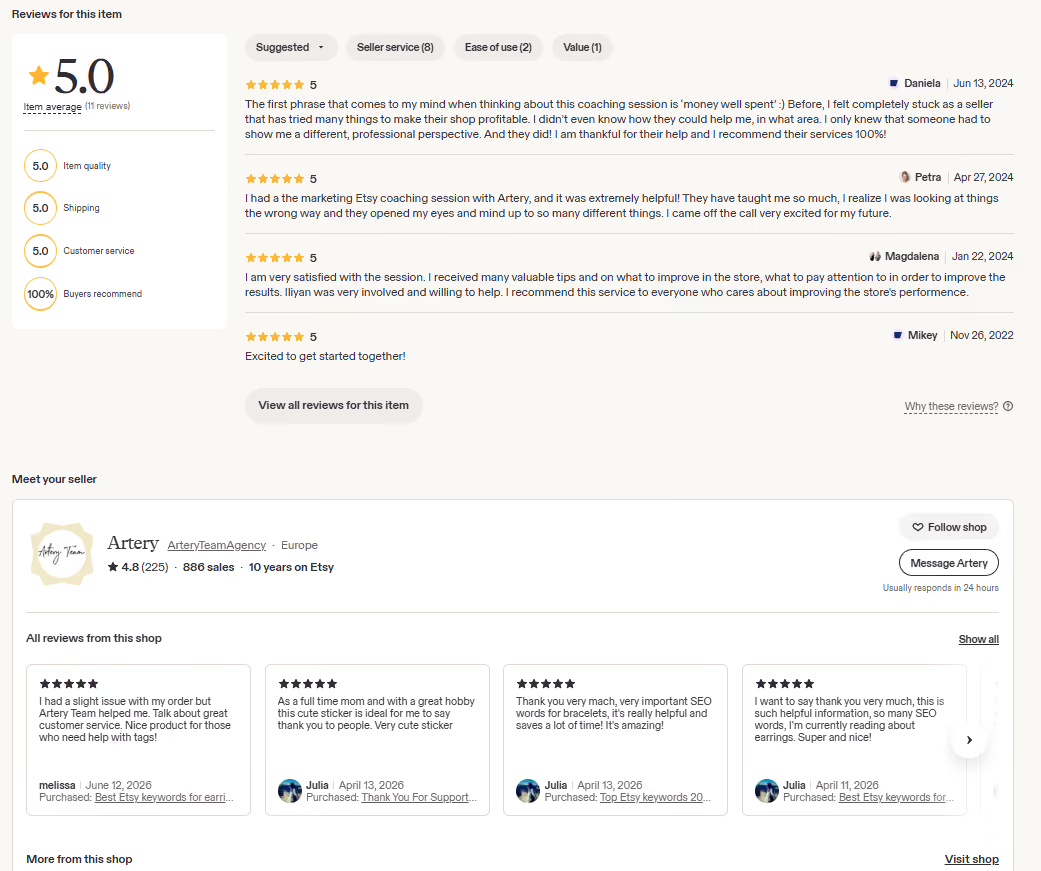
Reviews have always played an important role in conversions and purchase decisions, but their increased visibility makes customer satisfaction even more important. Most customers are reasonable, while a few situations can be more difficult - even "pain in the ass" sometimes. Even then, stay respectful, respond quickly, and do your best to find a fair solution.
With reviews taking up more space across Etsy, 1 or 2-star ratings can sometimes cause a temporary slowdown for the entire shop. You cannot control every outcome, but clear expectations, accurate listings, reliable shipping, and thoughtful communication can help prevent misunderstandings and protect the trust you have worked hard to build.
Etsy’s new listing layout is not a reason to rebuild your entire shop overnight. It is an opportunity to review how buyers experience your products and remove anything that creates friction between interest and purchase.
Start with your best-selling and highest-traffic listings. Check how the first image is cropped, whether the key details are easy to understand, how smoothly buyers can choose their options, and whether your reviews, shipping information, and policies build confidence. With the Holiday Season approaching, even a few focused improvements can make a meaningful difference.
Use August and September to refresh, test, and fine-tune your strongest listings. The seasonal push starts end of August / early September and then moves very quickly through Halloween, Thanksgiving, Black Friday, and Christmas. From that point onwards, there are almost continuous priority weeks and seasonal opportunities through the end of the year.
If you see you need support in optimizing your customer experience and visual marketing, the Creative team here will have a few open seats for the new season. You can reach out to check whether your store qualifies to enroll in our Creative Marketing programs.